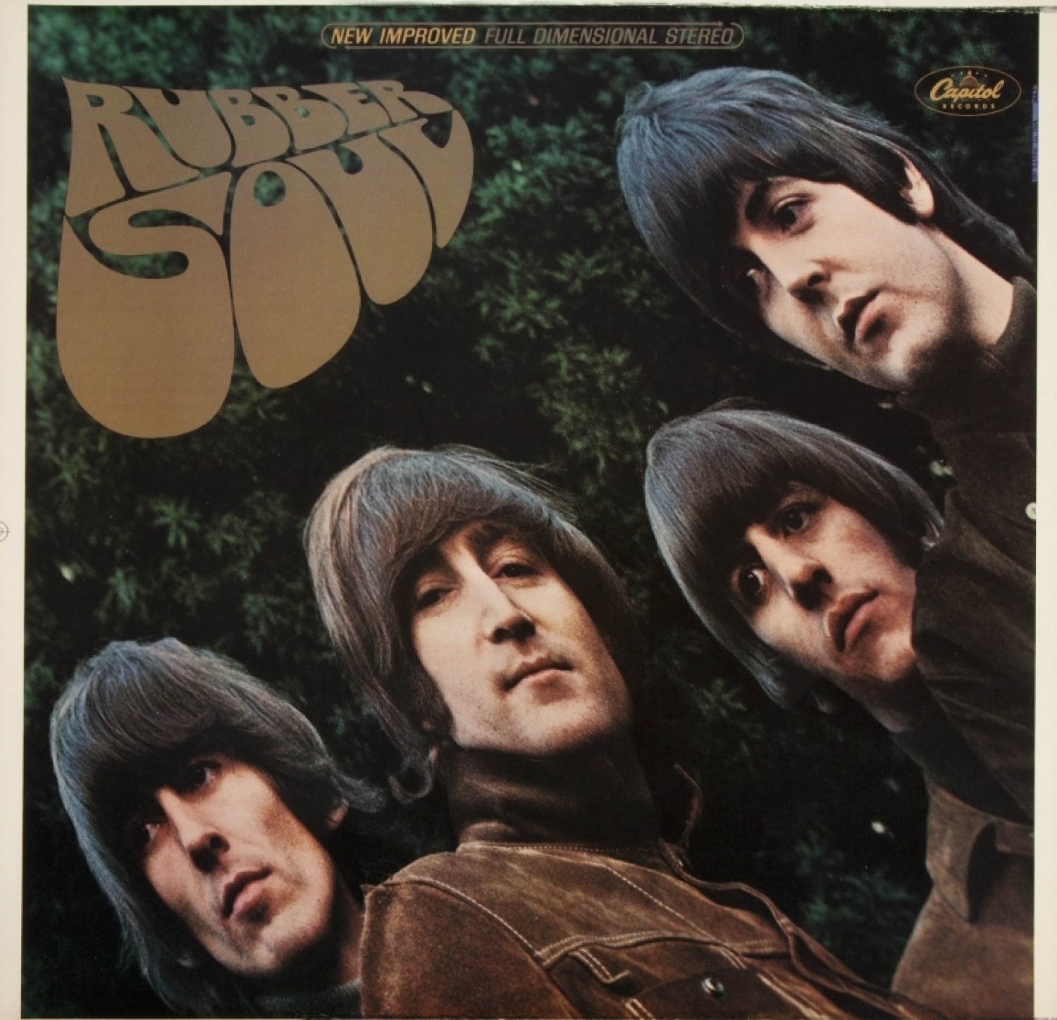
“There is no p-l-a-s-t-i-c in Rubber Soul”
by Jude Southerland Kessler and Rande Kessler
What a thrill to have my husband Rande Kessler with me this month to explore the artistry of Rubber Soul’s unique cover. Rande is a respected Louisiana artist who was selected as The Caroline Dorman Artist of the Year and featured in a one-man show in Shreveport’s Norton Art Gallery. He won the Melrose Arts Festival and his multi-media sculptures of The Beatles were featured at The GRAMMY Museum of Mississippi’s Beatles Symposium. and he has drawn the unique portraits of John Lennon that grace the covers of She Loves You, Should Have Known Better, and Shades of Life, part 1 (Vols. 3, 4, and 5 in The John Lennon Series.) Rande is the owner of OnTheRockBooks and co-hosts the Focal Points webinars with me. Here are his insights into this magical, unique Beatles album cover!
What’s Standard:
Date Released: 3 December 1965 in the U.K. as the sixth studio album by The Beatles. 6 December in the U.S.
Date Photographed: Late 1965
Location: Many sources state that the location for the photo shoot was John Lennon’s Kenwood garden in Weybridge, Surrey, U.K. (according to Robert Freeman and Bill Harry, The Ultimate Beatles Encyclopedia, 255, and Spizer, The BEATLES Rubber Soul to Revolver, 192-196.)
Photographer: Robert Freeman; graduated from Cambridge in 1959. Before beginning his professional career as a photographer, he worked for a short time as Director of Contemporary Arts in London. In 1963, Freeman, who was noted for artistic portraits of jazz musicians, “made a chance phone call to Dick Fontaine” a friend of his in Manchester. Fontaine had filmed The Beatles in the Cavern Club and suggested that if Freeman wanted to photograph musicians, he should “have a look at them, as they were a talented band…” (Freeman, p. 8) So, after contact, Freeman was asked by Brian Epstein to send photo samples to Wales to show the boys. He assembled a portfolio of portraits he had taken of jazz musicians, such as Dizzy Gillespie and John Coltrane. On 20 August 1963, at Epstein’s request (and after the boys had seen the work), Freeman traveled to meet them. (Freeman, p. 9) His artistic focus on musicians’ portraits and musicians in concert, was the “flash” that highlighted his photographic talent for the Fab Four.
The Photographees:
John Lennon, sporting a brown suede jacket, second from the left on the cover, obviously taking a “selfie,” looking at the camera with scrutiny and a hint of panache. There was a small, loose thread on his right shoulder which was airbrushed out on most covers (Spizer, The Beatles for Sale on Parlophone Records, p. 206 and http://webgrafikk.com/blog/uncategorized/lennons-thread/ You can see the thread in this…thread).
Ringo Starr, also wearing a brown suede jacket, with a blank stare to his right.
Paul McCartney, again with a suede jacket, this time more charcoal-colored, seems concerned with something George spotted.
George Harrison, barely in the picture (as was often his complaint) looks concerned about being too close to the edge of the album cover. He is quoted as saying about the album, however, “…The picture on the front is pretty good.”
Background: Rhododendron bush, not marijuana. And no LSD was harmed in the creation of the Rubber Soul artwork.
Sources: The Rubber Soul album covers, both EMI and Capitol; Lewisohn, The Beatles Recording Sessions, 69, Spizer, The Beatles for Sale on Parlophone Records, 204-206; Spizer, The BEATLES Rubber Soul to Revolver, 192-196; Freeman, The Beatles, a private view, 8-9 and 64, Martin, The Beatles Diary, Vol. 1, 216; Kruth, This Bird Has Flown: The Enduring Beauty of Rubber Soul Fifty Years On, 37-42, and Harry, The Ultimate Beatles Encyclopedia, 254-255.
What’s Changed:
- The times – According to Spizer’s compilation and as stated by Freeman himself, Freeman was searching for “…another angle on the group and a different tonality…“ (Freeman, p. 64). Kruth (This Bird Has Flown, p. 37) discusses this change in angle and tonality as compared to Freeman’s previous photo work on Beatles for Sale. Freeman, of course, had been photographing The Beatles since Meet the Beatles, making Rubber Soul his fifth cover endeavor, albeit his last.
- No matching outfits…and no ties – The Beatles are not in a “posed band” or photo-promo shot. And the boys “stood shoulder to shoulder, huddled together in the cool autumn air.” (Kruth, p. 37) Indeed, to quote Robert Freeman: “Uniformity was out.” (p. 64)
- An album as artwork rather than simply “a collection of singles” – According to George Martin, the intention was to present “a new Beatles to the world…And Rubber Soul was the first to emerge that way.” (Martin, p. 216) Robert Freeman, it seems, was achieving that by first developing a photographic moment in dissolving light, perhaps to show a dissolving from “Beatles before to The Beatles after”? Next, Freeman adds graphic distortion to the photograph, which happened by accident, but was liked by The Beatles (Freeman p. 64). Viewers were now seeing The Beatles’ images as reflections in a chrome door knob. Perhaps, as we reached for them, Freeman was inviting us to open the door to a new album experience.
- No “nametag” – The group’s name does not appear on the cover for the first time in Beatles history. (Spizer, p. 204) I think the time had arrived to acknowledge four individual artists creating music as a band, versus “a band” of four talented musicians. Cheers. Everybody knew their name.
This “say no more” license was repeated again with the advent of the White Album. As The Beatles’ ninth LP, it was officially released in 1968 as “The Beatles.” But fans quickly identified the record according to the look of the white jacket instead, without need for “the” band name!
A Fresh New Look:
Rande Kessler has been part of our Fest Family for the last 15 years. He has produced the over 45 Power Point presentations that Jude has given during that time. His “Shine On” Beatles original T-shirt and John Lennon “Should Have Been There” T-shirt have been bestsellers, and Rande’s “Doors of Liverpool” art poster of unique photographs of each Beatle home and venue has been a Fest favorite. Kessler’s work has been featured in the “Artists of the Wiregrass” showcase and in Dothan magazine.
Jude Southerland Kessler: Rande, I know you are…um, quite familiar with The Beatles. As an artist, musician, and photographer yourself, does anything come to mind that you’d like to share about the cover of Rubber Soul?
Rande Kessler: The Beatles, oh yes, that group from Liverpool!! They are, fortunately, in my life. I have T-shirts that say “Give Peas a Chance,” “While My Guitar Gently Weeps,” “Hey Jude,” (of course), and “Lived a Man Who Sailed the Sea.” I do have some thoughts about the Rubber Soul cover.
Robert Freeman said about all his cover photographs, “My intention was to keep the compositions simple, so that the focus of attention would always be on The Beatles as personalities.” With the Rubber Soul cover, I think the intention was to wash their personalities across another new canvas of Beatles music and art. I think when author John Kruth said of Freeman’s photography work, “The effect was to stretch the perspective…” he nailed it. (Kruth, p. 39)
Kruth goes on to say Freeman believed “the distorted effect was a reflection of the changing shape of their lives.” Rubber Soul was, as typical of The Beatles, a game-changer from cover-to-songmanship-to cover. The title with its equally transitional graphic also melded well with the photo work to depict the depth of The Beatles’ forever fluid offerings to the world. As usual, there was no shallow depth to that pool. In an article for The Daily Beatle, Patrick Roefflaer points out the Rubber Soul clever wordplay on ‘Plastic Soul.’” He elaborates that “plastic soul” was an expression “that black musicians were using to describe The Rolling Stones.” Mark Lewisohn adds: “Paul frequently repeated the words, ‘Plastic soul, man, plastic soul!’ And then, for the benefit of the other Beatles, and now history, he went on to explain that it was a phrase coined by black musicians to describe Mick Jagger.” (The Beatles Recording Sessions, p. 69)
The “rubber” component was explored further by graphic designer Charles Front (contacted by Freeman for the lettering) using his “innovative typography,” as Kruth puts it. Front researched rubber processing and successfully added the graphic look of rubber to the letters themselves. Front said, “If you tap into a rubber tree, you get a sort of globule…” (Spizer, The BEATLES Rubber Soul to Revolver, p. 192) And voila!
So, here we have an album cover, graphics, and title that encompassed The Beatles’ history and love of black rhythm and blues, The Beatles’ competitive and respectful musicians’ dance with The Rolling Stones, The Beatles’ introduction of albums as art collections, The Beatles’ transition from “the way they was,” and even the triple entendre of mixing rubber vs plastic, soul vs sole, and fluid graphic to fluid sound. Who knows, maybe they even thought, “Hey, Rubber Soul begins with “R – S” for more axe-play with “R-olling S-tones”?
The cover was subtle, and obvious, and fluid: an artistic portrayal of a transition, and of the four unique individuals involved in that change. Much detail about the cover development process and edits is provided by Spizer and Freeman – and explored by Kruth – but the artistic view of the cover art challenges us to see beyond the clever cover creation and into the creativity it presents.
What individual personalities do each of us see in Robert Freeman’s photograph? What messages are being conveyed? How does the cover encourage us to use new perspective when we pull the LP from the sleeve and listen? The artistry of the best photograph is to capture myriad descriptions in one still scene: to make a statement. In the case of the Rubber Soul cover, it also captures the observer. Instead of reacting to the cover art with stagnant appreciation, we react with dynamic processing. We think, “Hmmm, what’s this about?”
Freeman wanted to use his skill to present us with four Beatles pens and one signature, to introduce us to the full art potential of album covers, and to tease our sense of reality with distortion. And when we look at the Rubber Soul cover, Lennon clearly tasks us to try to keep our balance.
For more information on Rande M. Kessler, HEAD HERE


